Payment user flow conversion rate improvement
Bridge API provides a user flow to customers (e-shop, accounting sotfware) enabling their users to easily pay carts and invoices by wire transfers. Our goal was to improve the payment flow conversion rate.
Industry
Fintech - SaaS
Role
Product Manager + UX Designer
Year
2023
Expand payment by wire transfer to new use cases
I worked as a Product Manager for this project, teaming up with a Product Designer. I owned the problem definition phase, the user flows and wireframes, and he owned the UI part. We led user tests together.
At Bridge, the wire transfer payment feature was mainly used:
- to pay invoices in accounting software
- for money recovery for e-shop websites
We wanted to expand our use cases to diversify our revenue streams. After some research with the marketing team, the new promising use case was to provide a wire transfer payment method for e-shop websites.
Our first version of the payment user flow had a low conversion rate: 33%.
Even if we don’t own the entire journey, we needed to improve this conversion rate to improve customer and user satisfaction and to improve our profits by opening the feature to the e-shop use case.
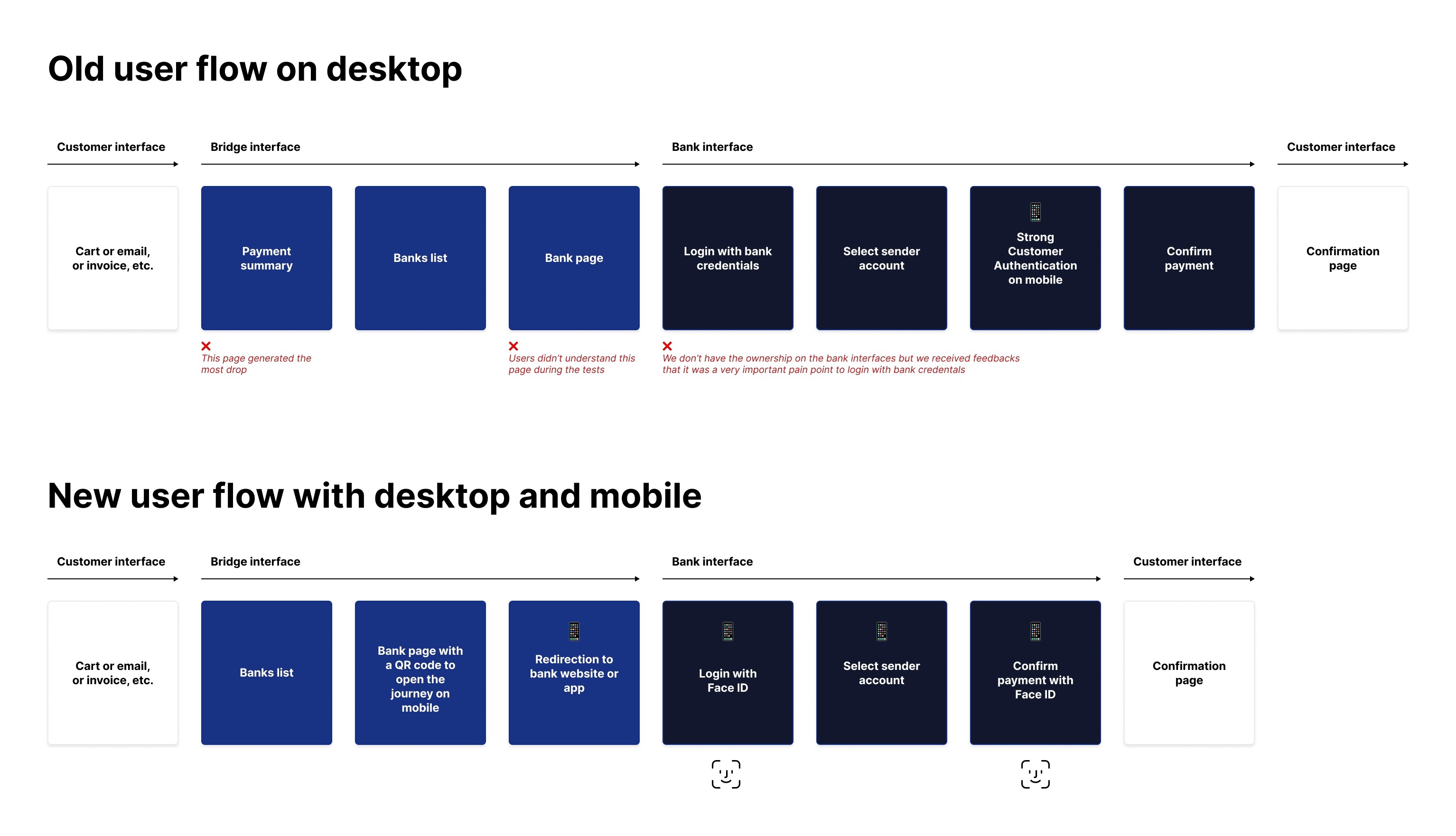
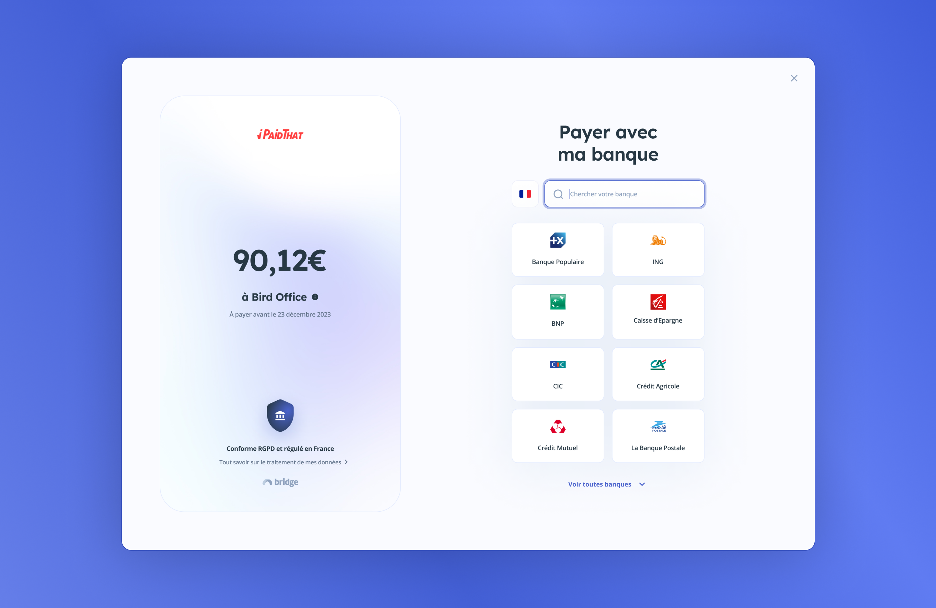
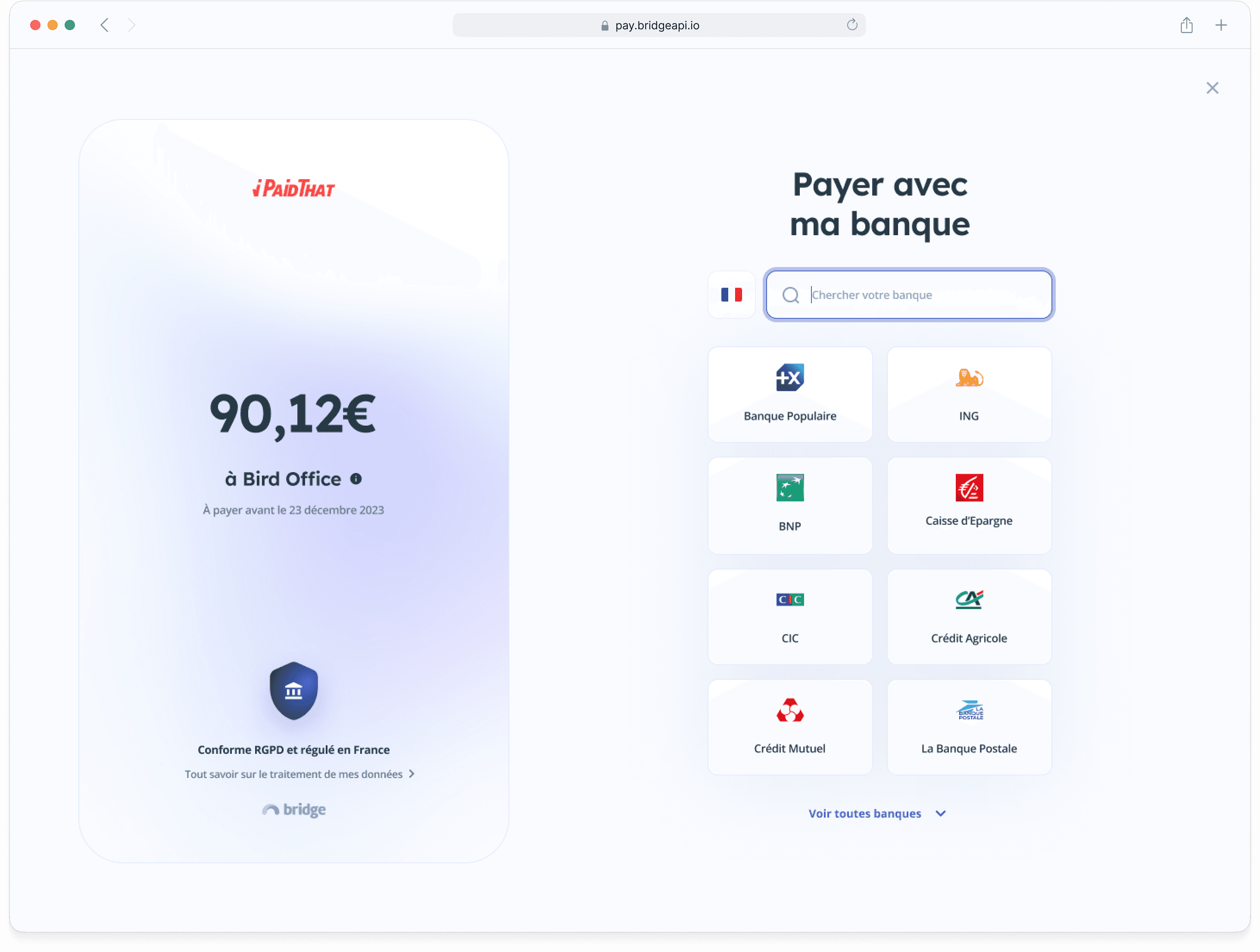
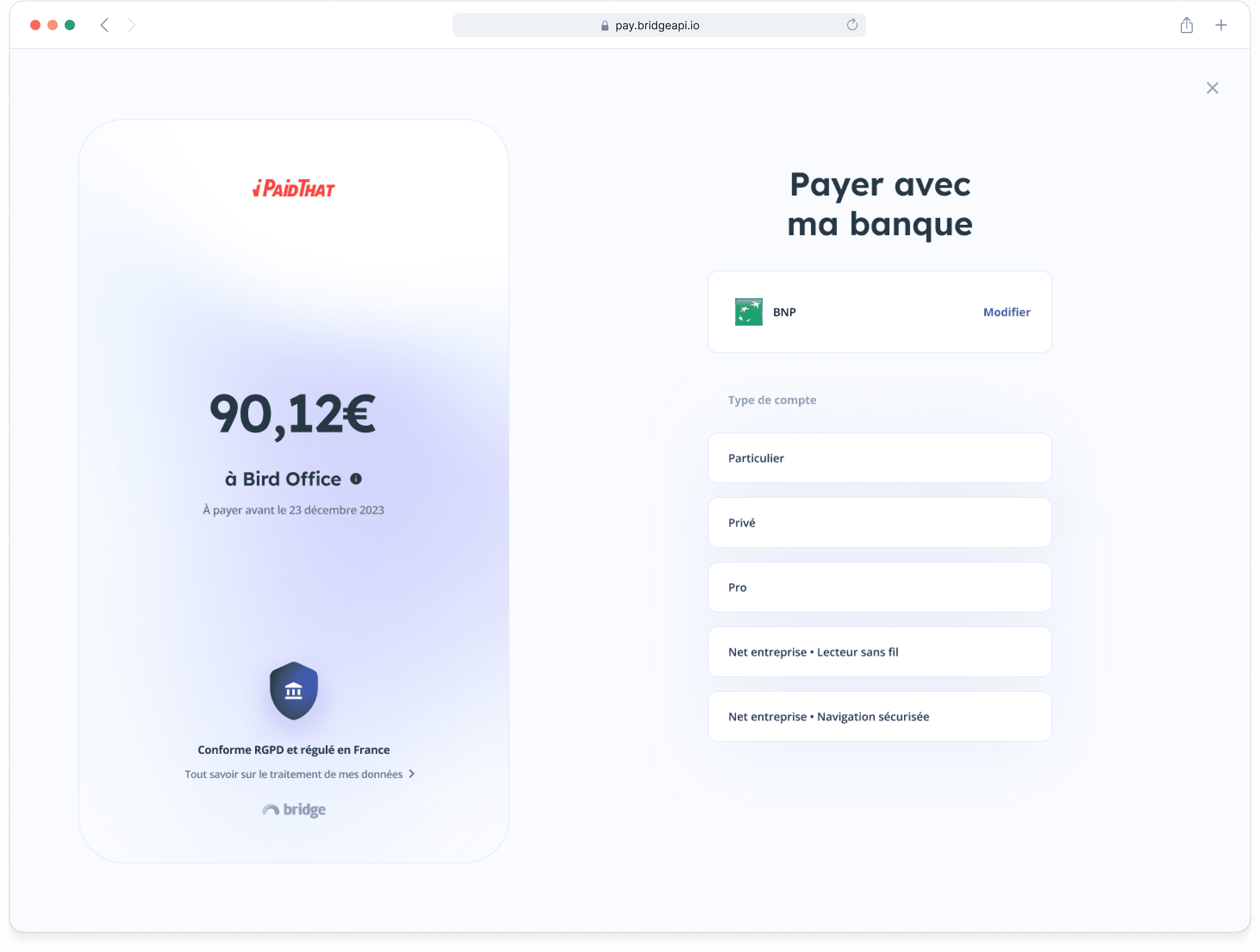
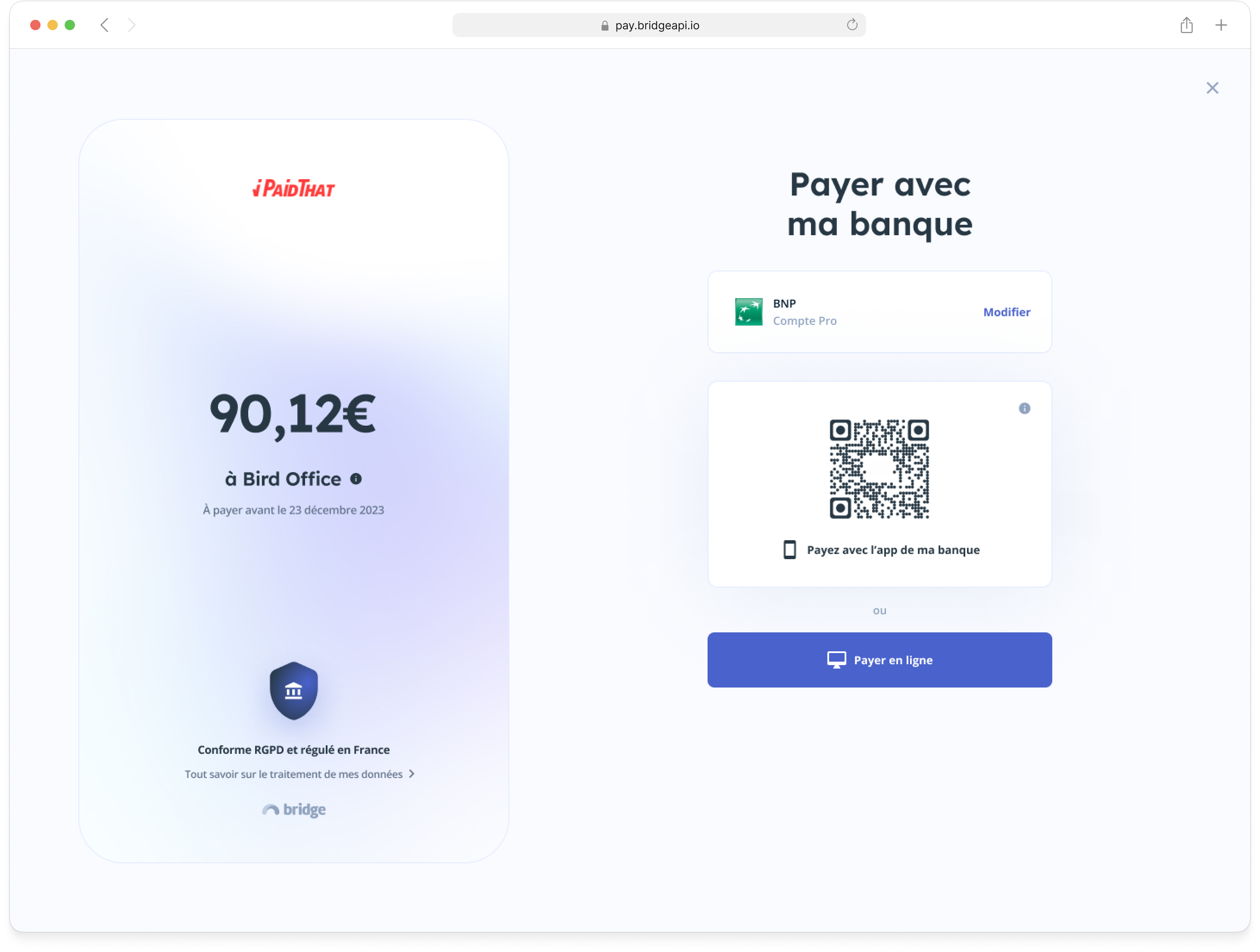
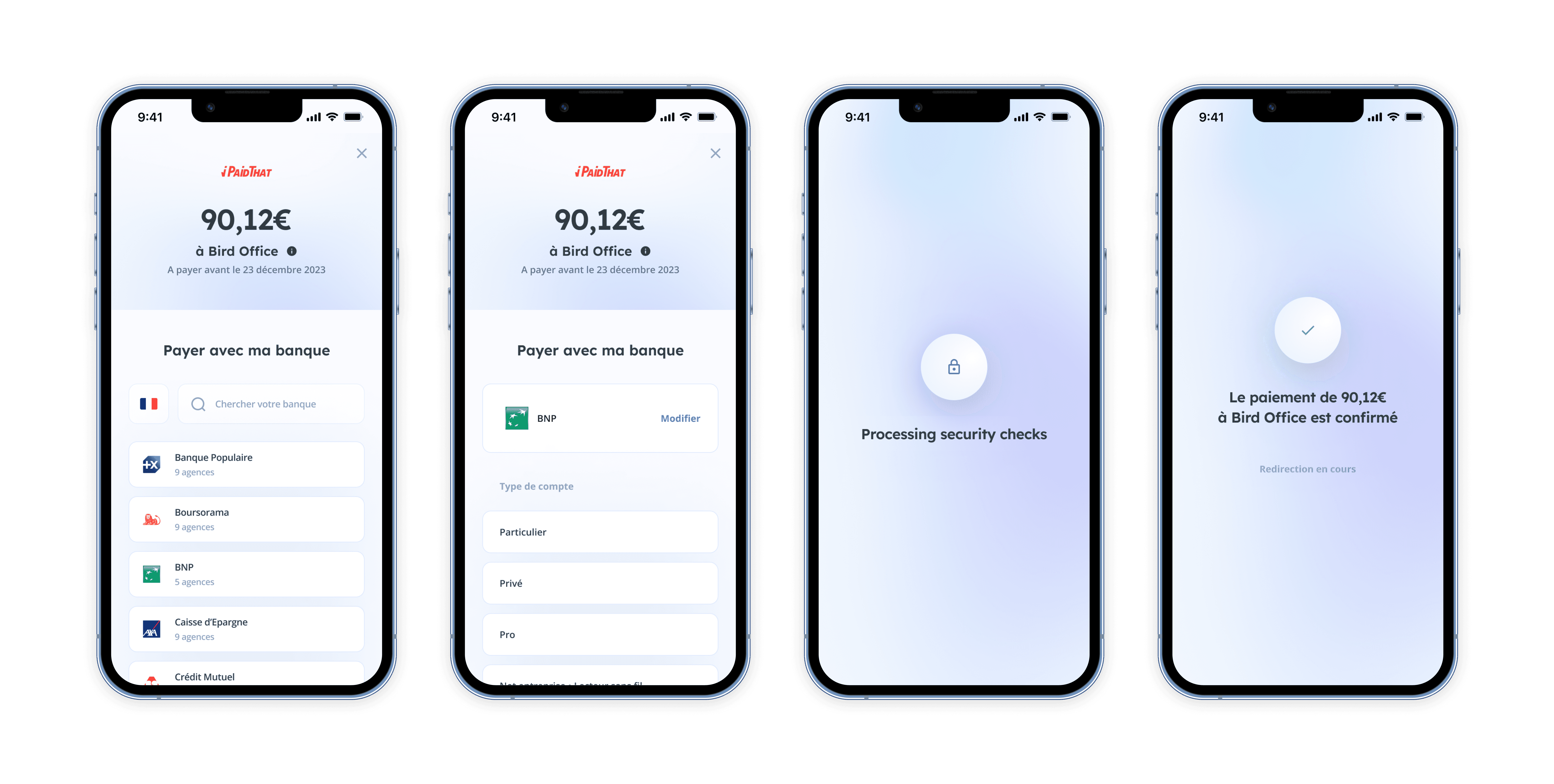
Removing friction and reassuring users when connecting to their bank
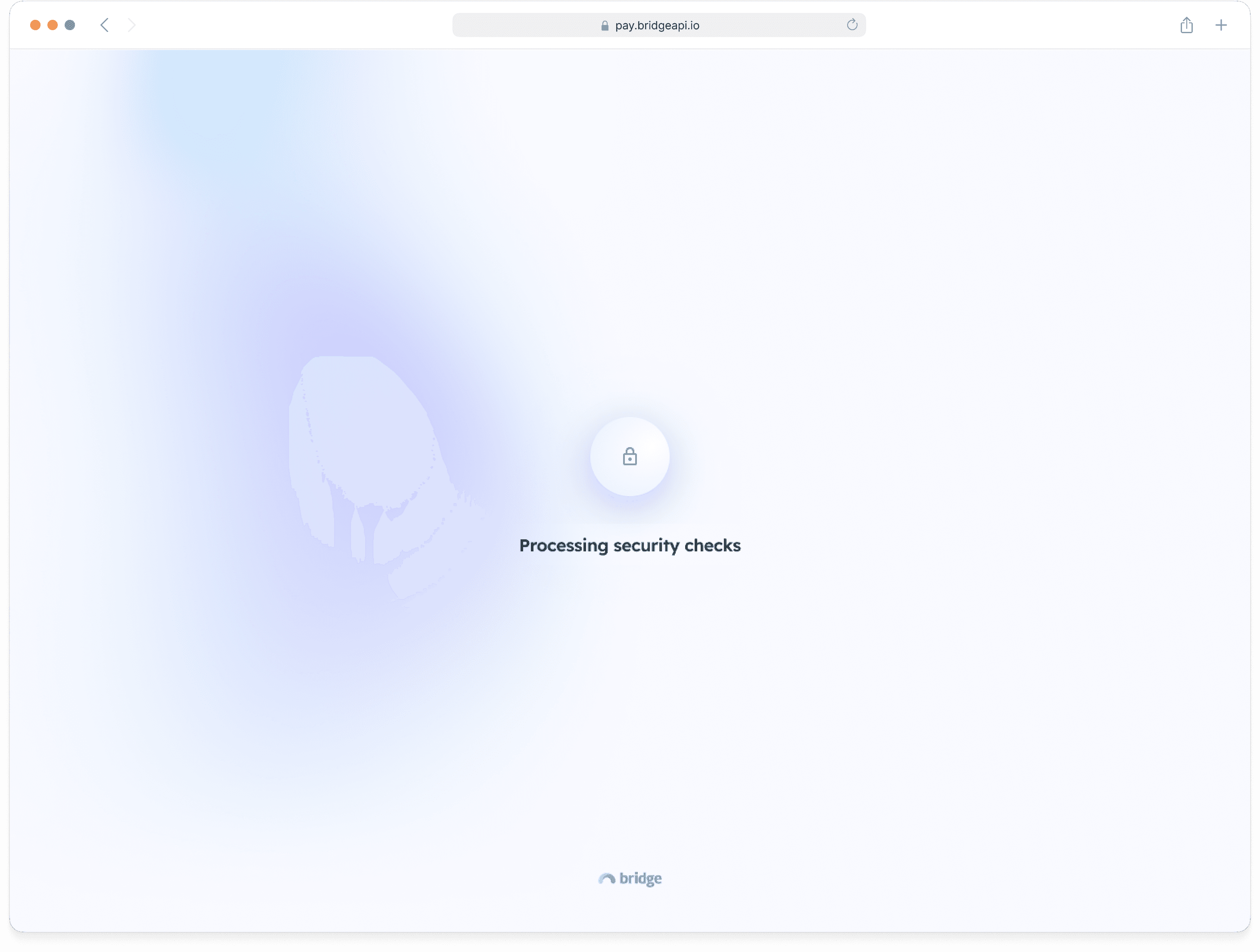
The biggest pain point was that on desktop, users needed to know their bank credentials to confirm the payment, while they only needed Touch ID or Face ID on mobile.
This step is both a friction and a source of stress: what if I’m not redirected on the right website?
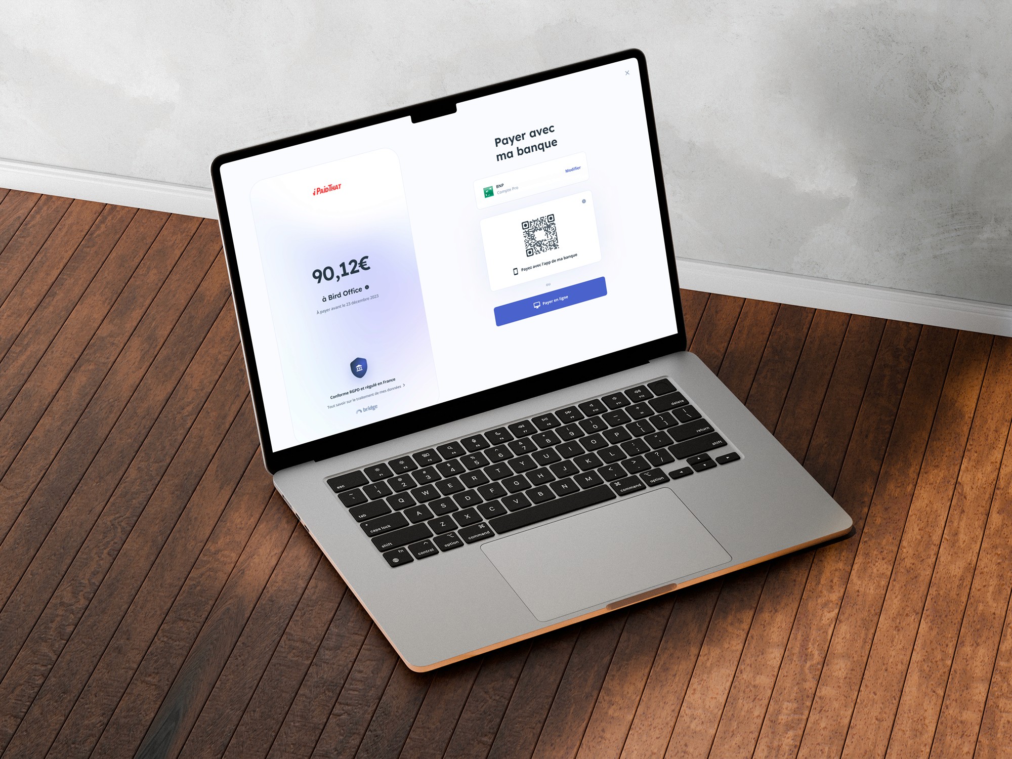
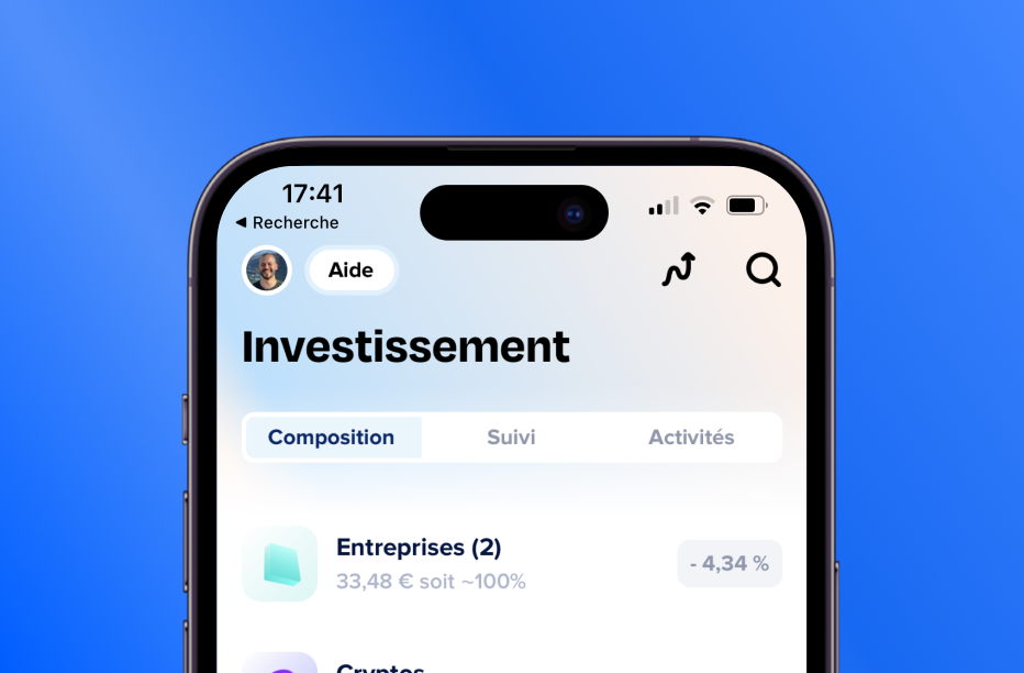
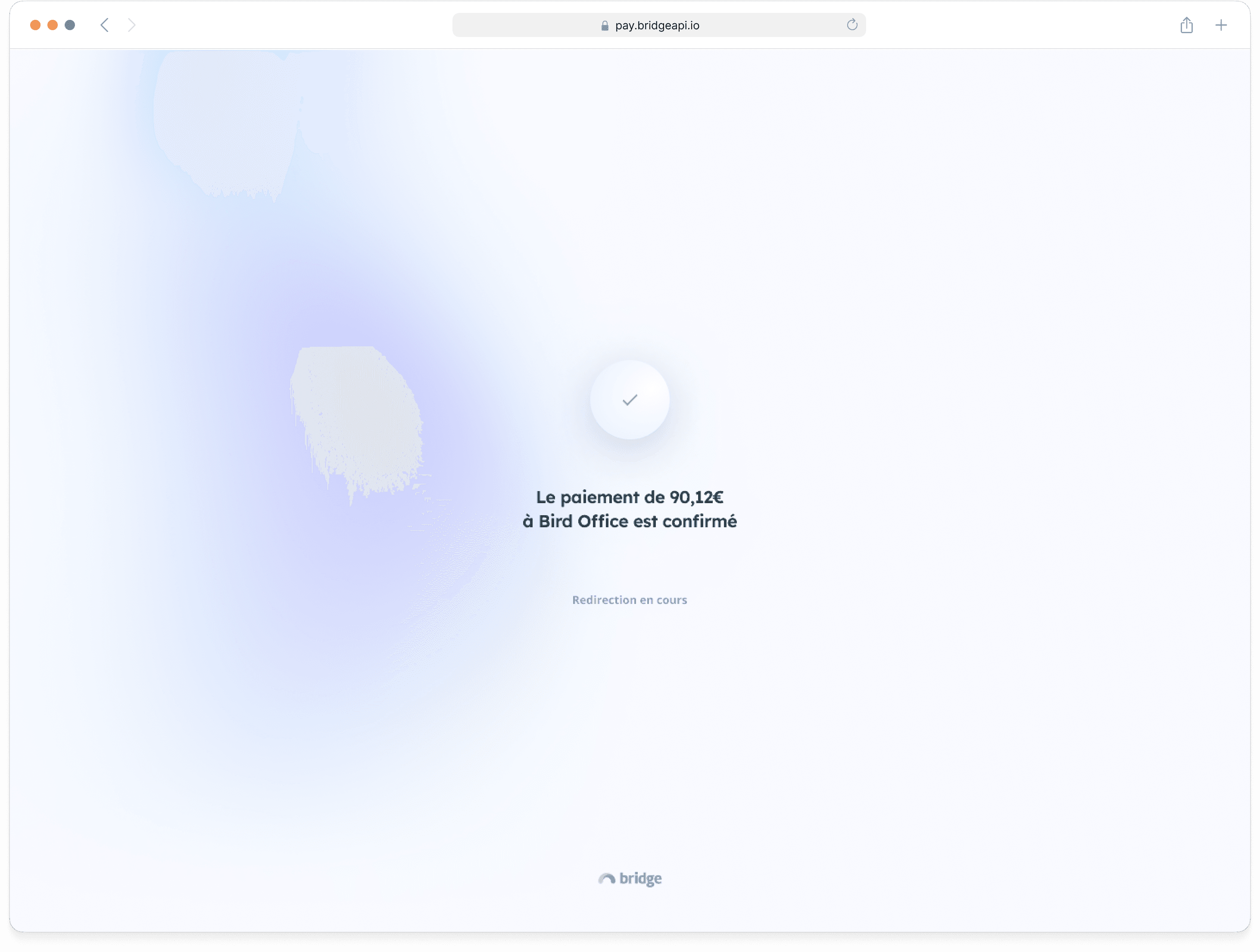
Revamping the whole user flow with new brand guidelines and reassuring copy
We also needed to revamp the interface with the new brand graphic guidelines during this project.
We decided to proceed in 2 steps:
- Revamp the user flow with the brand guidelines, fewer steps, a simpler banks list and reassuring copy
- Allow desktop users to switch to their mobile to confirm the payment
+10 pts
Conversion rate improvement
from 33 to 43% after the revamp
Job is not finished, we still have work to do
While we were pretty happy with the results, we knew that to continue improving the conversion rate, we would need:
- to increase the number of banks available
- to customize the flow and copy depending on our customers’ use case and user journey