Simplifying the Garmin Connect mobile application
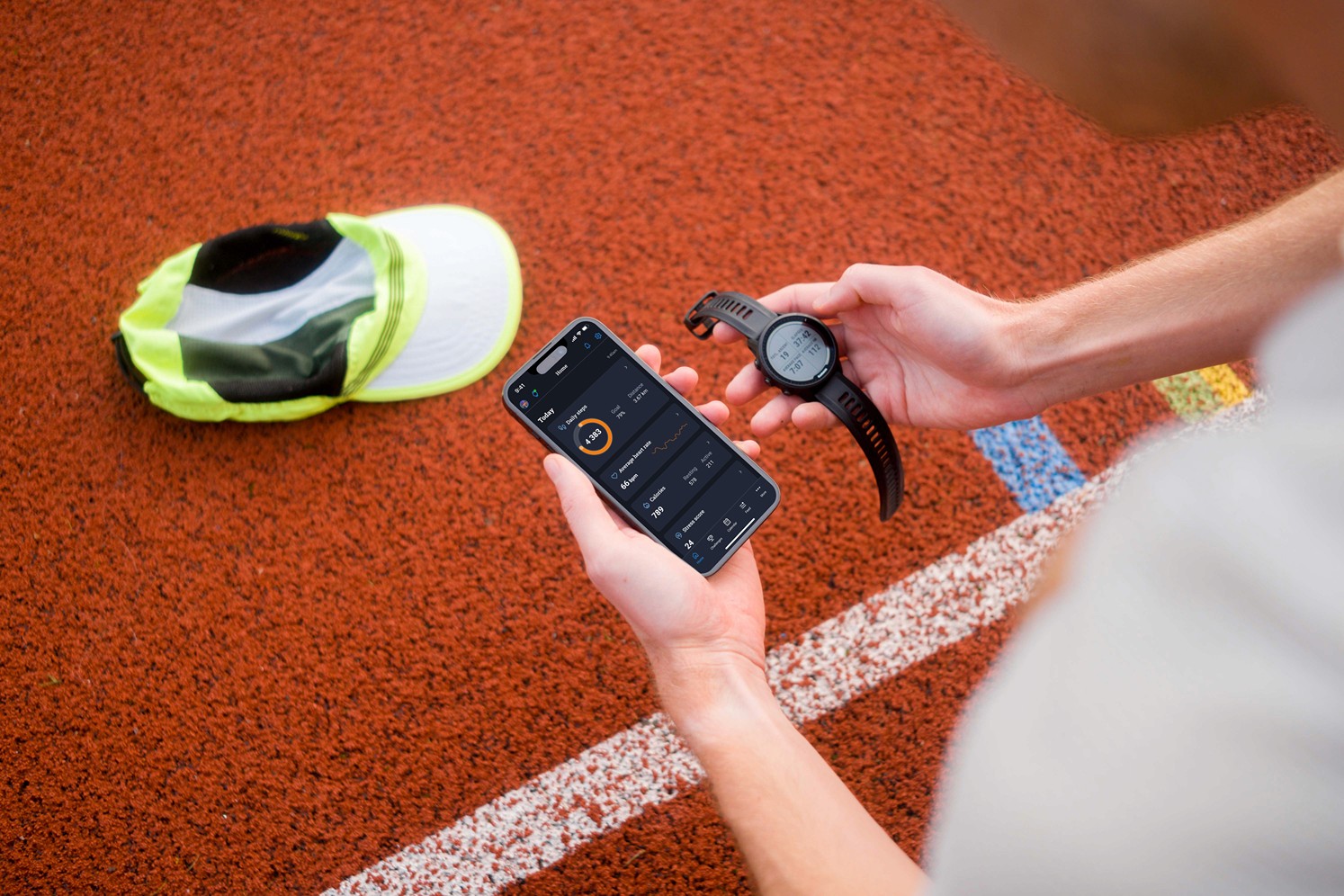
How to improve Garmin Connect mobile application? Since I use my watch and the app a lot and I think there is room for improvements, I worked on my own version to try to simplify it.
Industry
Sports - B2C mobile app
Role
Product Designer (personal project)
Year
2023
A quick note first
This is a personal projet I did to train my user research and UI skills. I chose this fictional start point to make this project more concrete:
Garmin wants to create a strong emotional attachment between their devices and users, so that people stay with Garmin when they buy a new watch or GPS device. They know that a lot of this attachment is related to the device itself, but they feel like the mobile application Garmin Connect could play a bigger role here.
Increase mobile app usage to drive brand retention
A statistic does not please Garmin stakeholders: 50% of users open the application only after uploading a new activity, and never between two activities.
Garmin wants to start a research project about this to improve this metric and therefore help the company key result including in the global strategy: 90% of Garmin customer renewing their device buy a Garmin one.
My goal here is to increase the mobile application usage to drive customer retention and meet the company key result above.
How could we encourage users to use the Connect app more
I used several methods here:
- First, I read the App Store and Google Play reviews to have an overview of users’ satisfaction
- Then I scanned some reddit threads to dig into some users questions and feedbacks
- With this material and my assumptions, I defined a user interview guide and I drove 4 semi-guided interviews to understand how users use the app, their motivations and frustrations
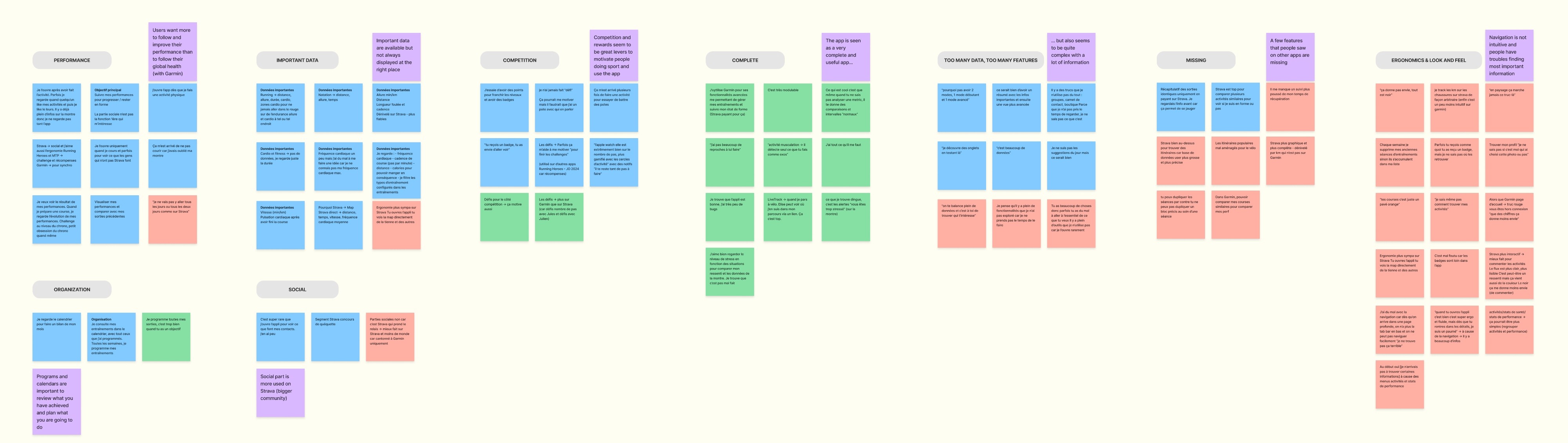
Help neophite sporties easily find the information they need…
…while keeping the app as complete as it is for the experts. That the main objective of this revamp. Here are the key insights I got:
- The app is seen as a very complete and useful app
- But also seems to be quite complex, with a lot of information
- Navigation is not intuitive and people have troubles finding most important information (important data is available but not always displayed at the right place)
- Competition and rewards seem to be great levers to motivate people doing sport and use the app

I nuanced my interviews insights with an online survey
After the interviews, I posted a survey on reddit with the same questions as my interviews but with closed answers, to confirm or unconfirm some learnings.
I could nuance some answers I received with the interviews:
- for example, the users I interviewed were very focused on sport performances. The survey allowed me to understand that health statistics were also important for other categories of users
- there is a blurry line for the social side of the app: 3 of 4 people I interviewed use Strava more for social interactions about sports, but only 27% of people who answered the survey use it
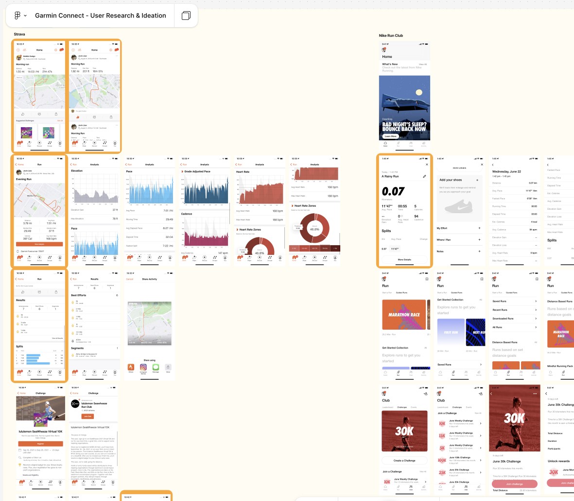
Focusing on simplicity, “going to the essential”
I benchmarked sport apps with Strava, Nike Run Club, Nike Training Club but also a health app with Withings and an app known for gamification: Duolingo.
What I found interesting with this benchmark: the social part in Nike and Withings apps is not very important but they still make an important focus on performances, levels and badges; with great simplicity.
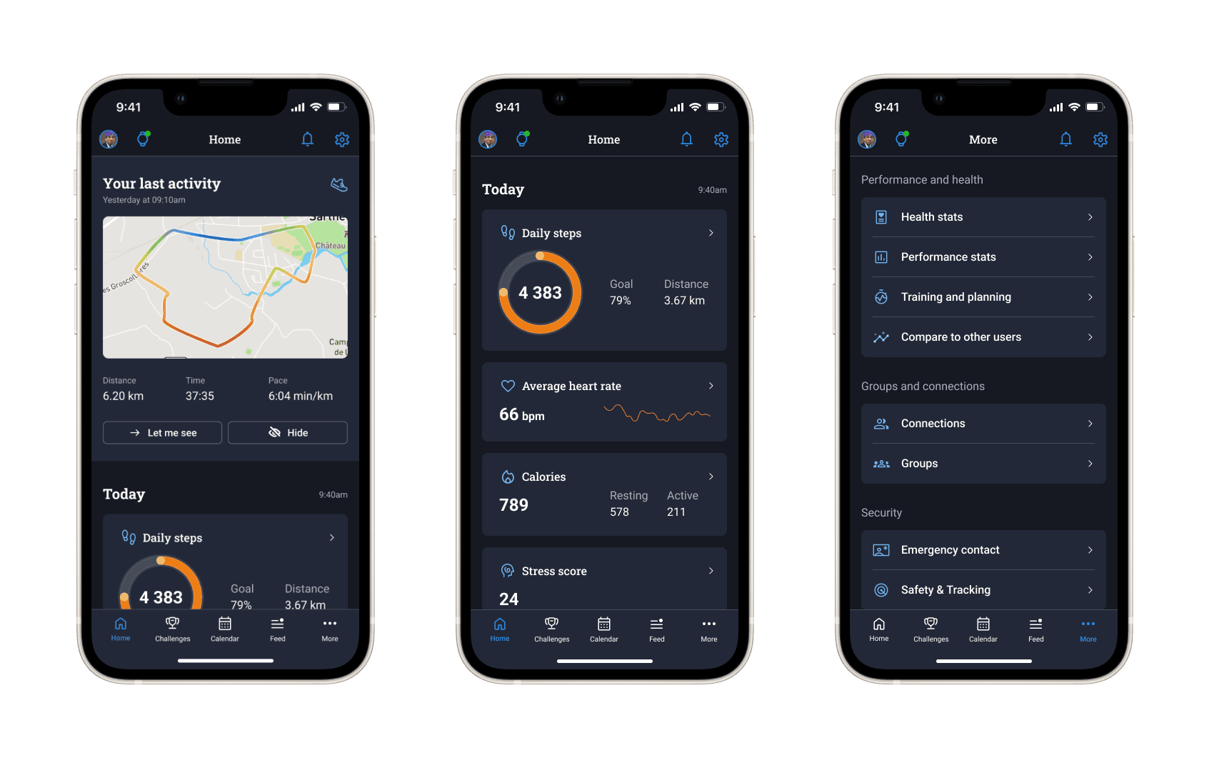
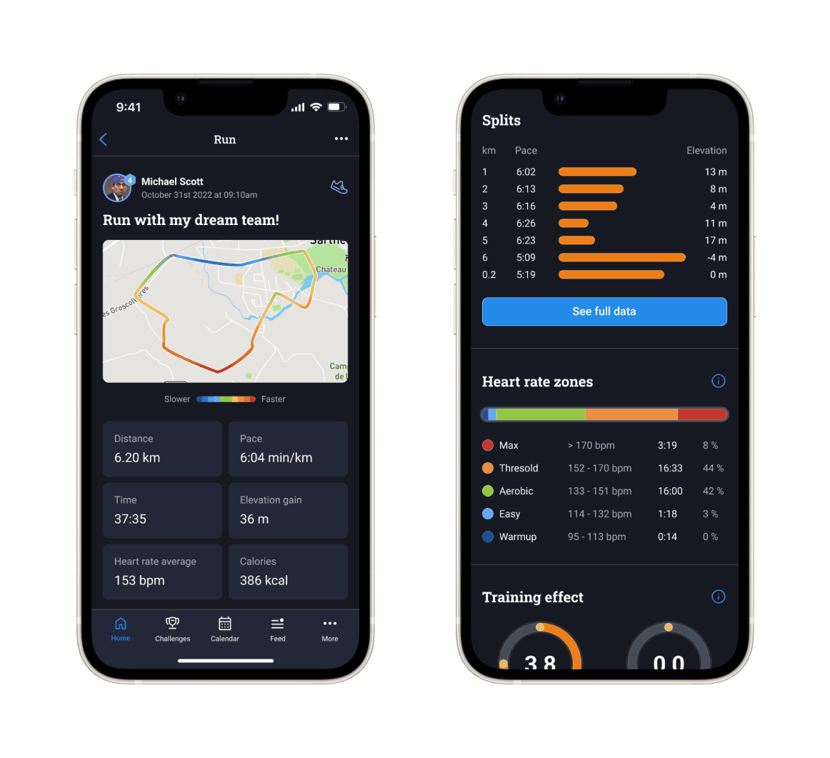
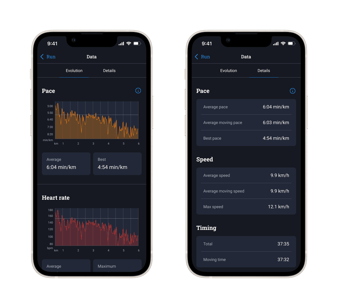
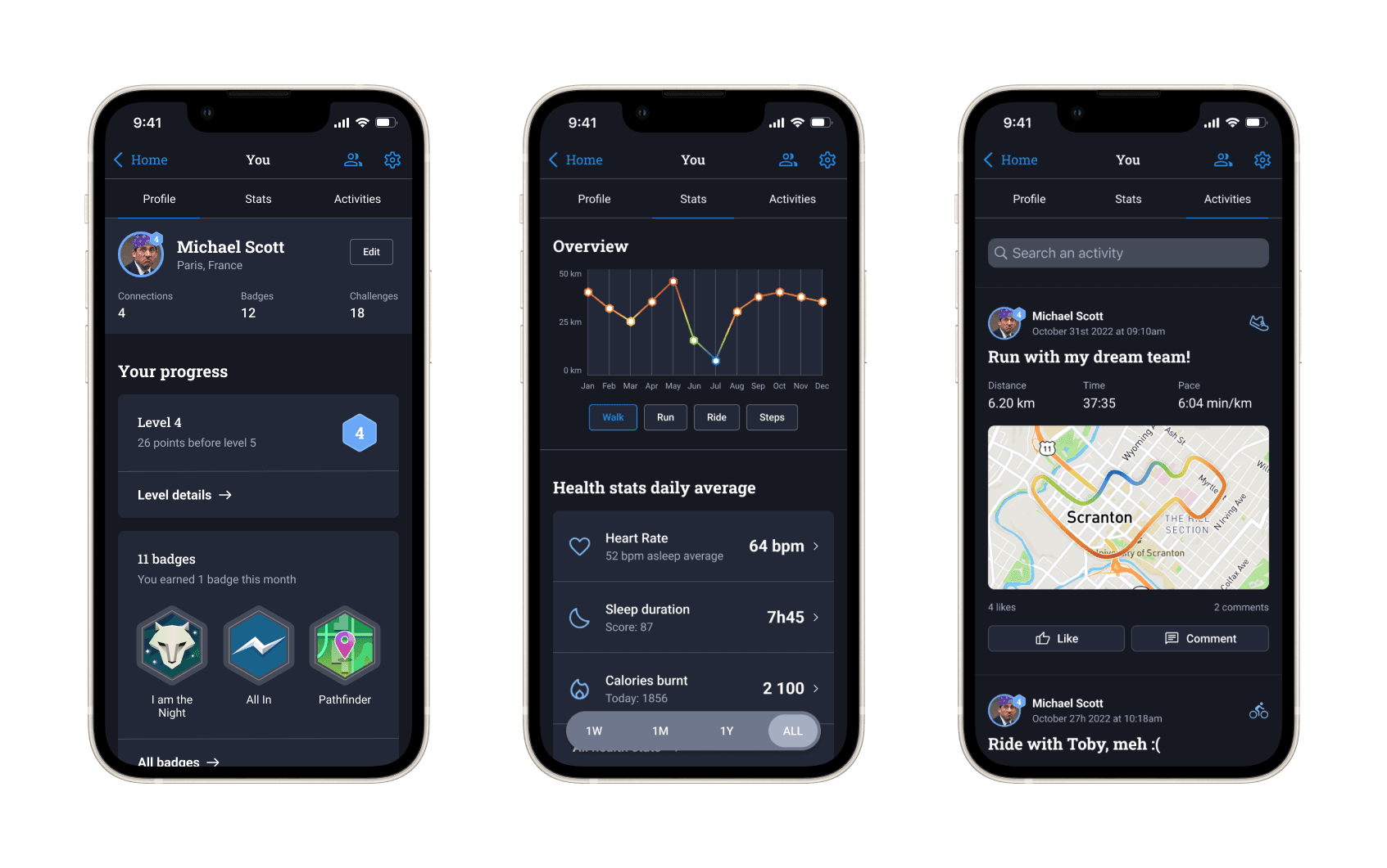
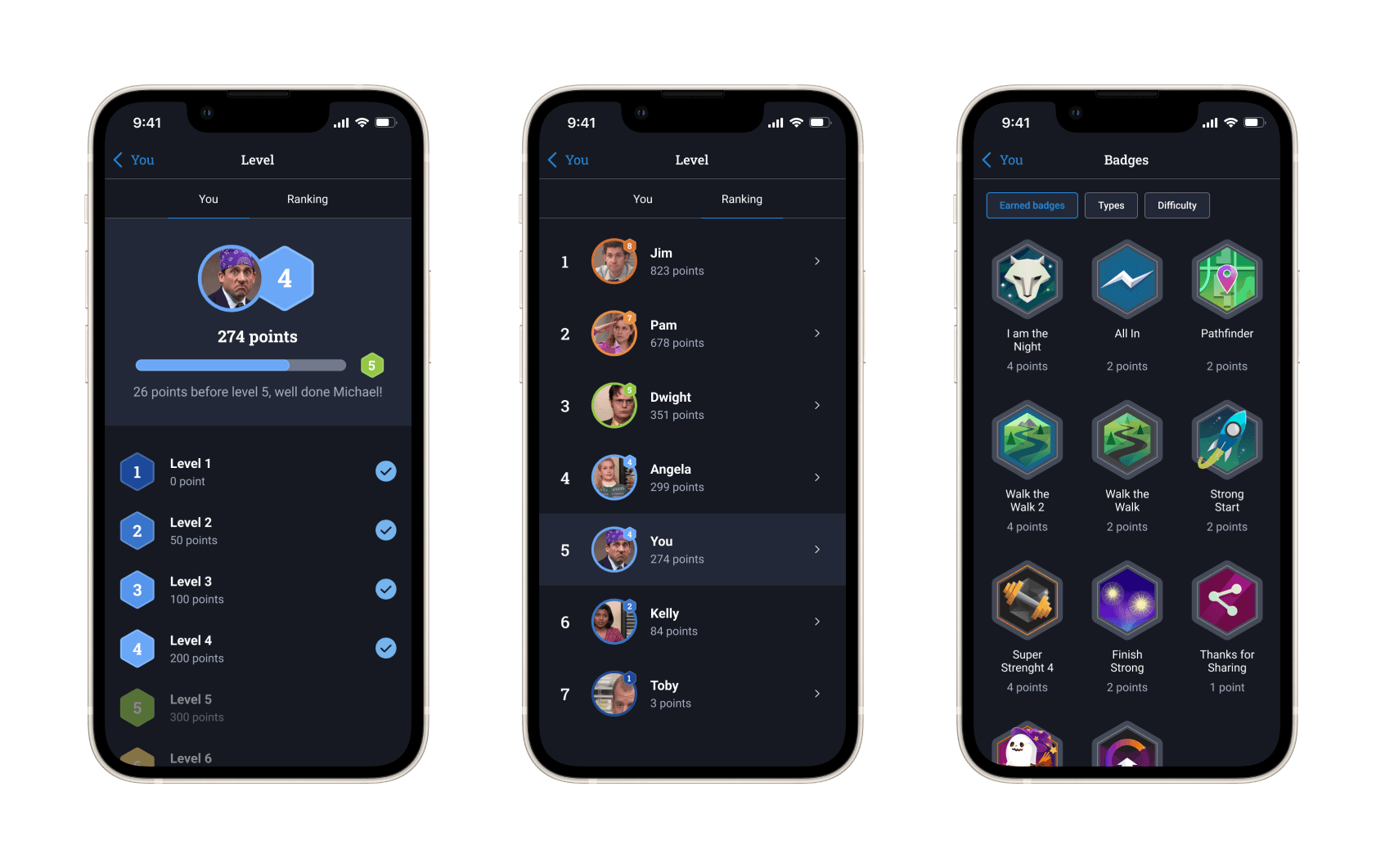
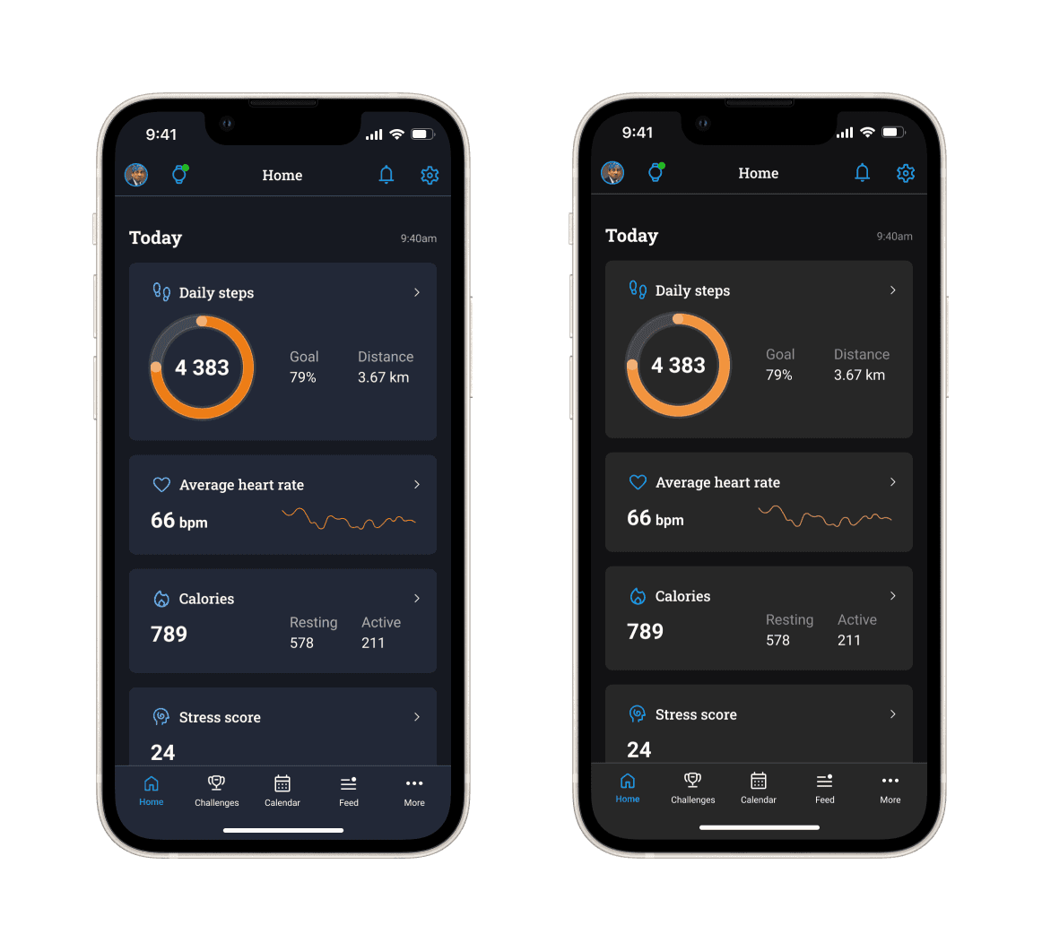
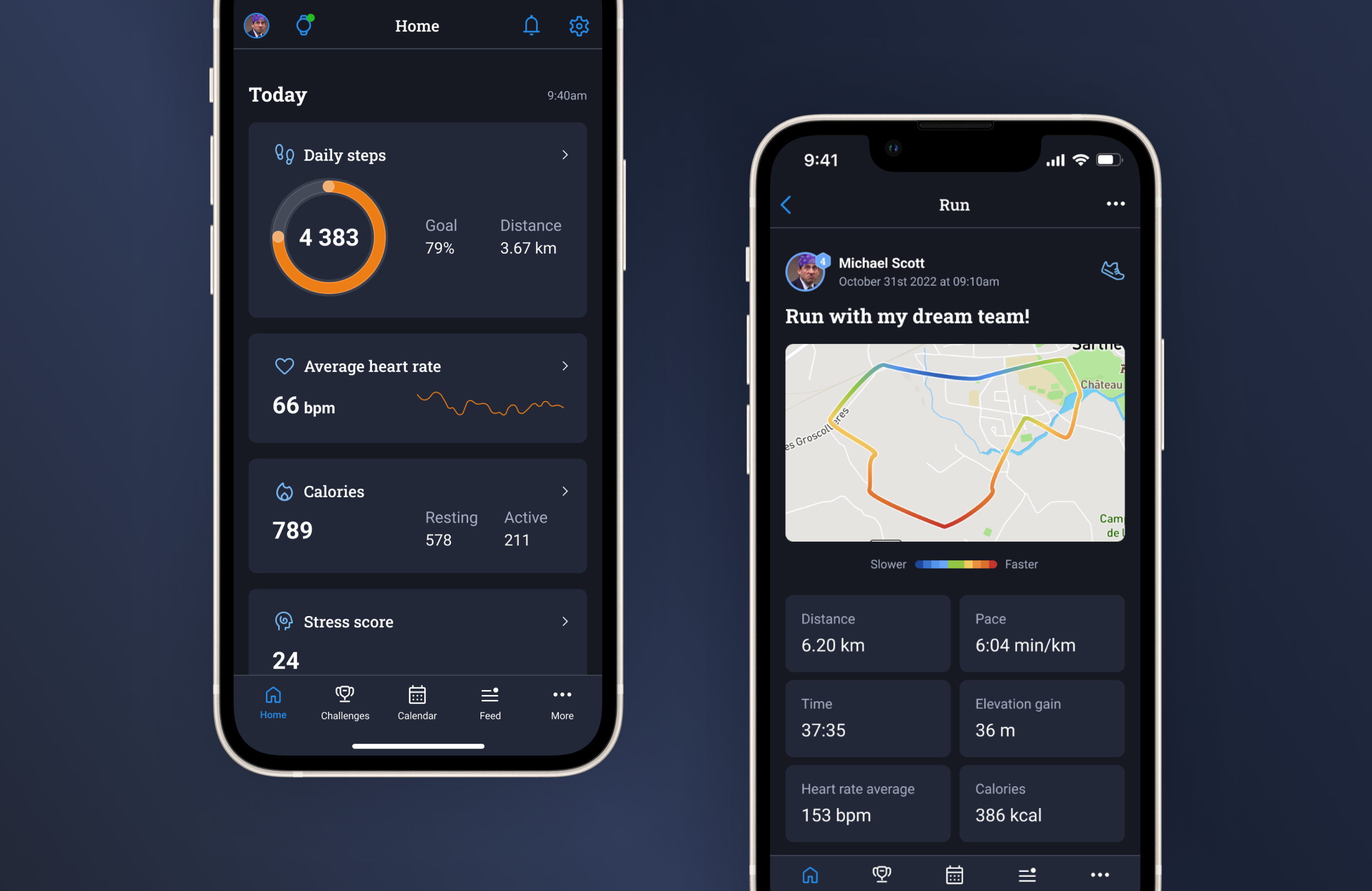
Redesigning the main part: homepage and navigation
My goal was not to redesign the entire app here so I decided to focus on the main screens related to my ‘How Might We’:
- homepage and navigation (simplification, focus on what is more important)
- activity pages (with a first section helping every one get the main information and an access to more detailed data)
- profile pages (to simplify and highlight levels and badges)
I also used these evolutions to try a new visual design for the app, because I got some feedbacks that it was not very friendly. It might be too far from the Garmin brand guidelines to I also made a version with current colors (see last screens).